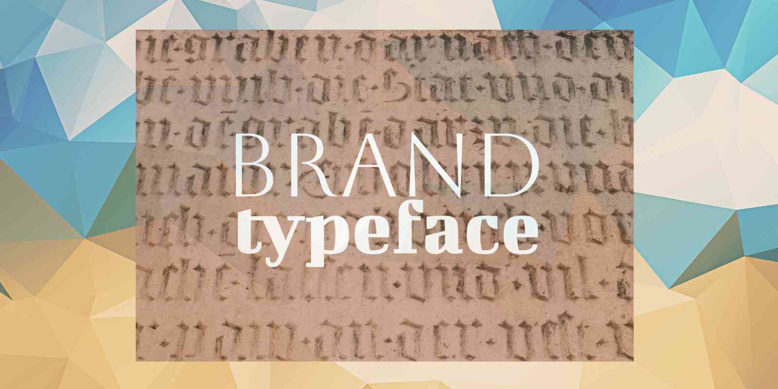
Typography plays a pivotal role in brand identity. The typeface you choose for your brand isn’t just about aesthetics; it communicates values, sets the tone, and establishes credibility. In this article, we’ll explore how to select the right typeface for your brand, focusing on its impact, considerations, and practical tips.
Why Typeface Matters in Branding
A typeface is more than a visual element; it conveys a message subconsciously to your audience. The right font can:
- Enhance Brand Recognition: Consistent typography helps your brand become instantly recognizable.
- Communicate Personality: Fonts have personalities. A serif font might communicate tradition and reliability, while a modern sans-serif might express innovation and simplicity.
- Affect Readability: Typography affects how easily your message is consumed. A legible font ensures your audience understands your communication without effort.
- Set Emotional Tone: The right typeface evokes specific emotions, such as elegance, boldness, or fun.
Key Considerations When Choosing a Font
1. Understand Your Brand Personality
Before choosing a typeface, identify your brand’s core values, target audience, and industry. Ask yourself:
- Is my brand formal or casual?
- Do I want to project innovation, tradition, or fun?
- Who is my audience, and what resonates with them?
For example:
- Tech companies: Often favor clean sans-serif fonts (e.g., Helvetica, Arial) to represent modernity.
- Luxury brands: May opt for elegant serifs or script fonts (e.g., Bodoni, Didot) to emphasize sophistication.
- Eco-friendly brands: Might use organic, hand-drawn fonts to evoke authenticity and sustainability.
2. Consider Readability
No matter how stylish a font is, it must be readable across various formats, from business cards to mobile screens.
- Body Text: For long paragraphs, use simple, easy-to-read fonts like Georgia or Roboto.
- Headlines: For attention-grabbing headings, explore more stylized fonts, but ensure they don’t overshadow the content.
- Digital Readability: Test the typeface on screens to ensure it scales well. Fonts like Open Sans and Montserrat are popular for web use.
3. Font Categories and Their Implications
Understanding font categories helps align the typeface with your brand's message:
- Serif Fonts: Timeless, elegant, and trustworthy. Best for law firms, financial institutions, and luxury goods. Examples include Times New Roman and Garamond.
- Sans-Serif Fonts: Sleek, contemporary, and minimalist. Best for technology brands and startups. Examples include Helvetica and Futura.
- Script Fonts: Elegant and creative. Best for wedding services, beauty brands, or high-end fashion. Examples include Pacifico and Edwardian Script.
- Display Fonts: Bold and decorative. Best for headlines, logos, or industries like entertainment. Examples include Lobster and Impact.
- Monospaced Fonts: Retro and utilitarian. Best for coding brands or minimalist designs. Examples include Courier New and Consolas.
4. Pairing Fonts
Most brands use more than one font to maintain visual interest and hierarchy. The challenge is to find complementary typefaces that work together seamlessly:
- Contrast but Complement: Use contrasting styles, such as a serif for headings and a sans-serif for body text.
- Limit the Number: Stick to two or three typefaces to avoid visual clutter.
- Consider Font Weights: Use varying weights (bold, medium, light) of the same font for consistency.
5. Scalability and Versatility
Your typeface should work across multiple platforms and sizes. Test it on:
- Print and Digital: Ensure the font looks good on both mediums.
- Responsive Design: The font should adapt to different screen sizes without losing clarity.
- Brand Collateral: Test your font on everything from billboards to social media posts.
6. Cultural and Emotional Sensitivity
Fonts carry cultural connotations. A font that works in one region may not resonate—or could even offend—in another. For example:
- Avoid overly ornate fonts in minimalistic cultures.
- Be cautious with Gothic or script fonts in contexts where simplicity is preferred.
Tips for Choosing the Right Typeface
- Experiment with Free Font Libraries: Platforms like Google Fonts and Adobe Fonts offer a wide range of typefaces to test.
- Customize for Uniqueness: Consider commissioning a custom font for distinctiveness.
- Test with Real Content: Preview the font with your brand’s actual text to see how it performs in context.
- Keep Accessibility in Mind: Ensure your font choices align with accessibility standards.
- Get Feedback: Share font options with stakeholders and sample customers to gather opinions.
Common Typeface Mistakes to Avoid
- Overusing Stylized Fonts: Excessive use can make your brand look unprofessional.
- Ignoring Licensing: Ensure you have the rights to use the font for commercial purposes.
- Lack of Consistency: Using too many fonts can confuse your audience and dilute your brand identity.
- Neglecting Mobile Optimization: Ensure your typeface remains legible on smaller screens.
Examples of Effective Typeface Use
- Apple: Uses the sans-serif font San Francisco, reflecting innovation and simplicity.
- The New York Times: Their serif font exudes tradition and reliability.
- Coca-Cola: The cursive logo font feels personal and timeless.
- Nike: Bold sans-serif fonts in their campaigns project confidence and dynamism.
Final Thoughts
Selecting the right typeface for your brand requires thoughtful consideration of your brand's personality, audience, and communication goals. A well-chosen font strengthens your brand identity, making your messages more impactful and memorable.
Remember, typography is a silent ambassador of your brand. Take the time to choose a typeface that aligns with your vision, resonates with your audience, and stands the test of time.
Hope that helps!
Good Luck.
